Okay we are finally ready to reveal this!
Now that we have officially finished building Colony 5, this is my customary blog post about it.
Internally we call it Colony 5 cos it’s the fifth location we signed, but it’s actually the fourth one we’re launching (cos the original 4th one delayed wtf).
Externally, it’s called Colony @ Mutiara Damansara. It’s our first location out of Kuala Lumpur and it’s located in the Curve area, just down the road from the McDonald’s drive thru! (which explains why my Mcds intake went up recently wtf). It’s situated in a beautiful new office building called KYM Tower.
We have about 19,000+ square feet of space, over two floors, and we’re on level 8 and 9!
Design wise…
If you guys have been following me, each coworking space of ours comes with a different design. No two spaces are alike, and I usually conceptualize the design based on what I’m feeling at the moment lolol. I also take into consideration the kind of guests we’d have there la, and their requirements, to create a suitable environment. Not that bimbo ok hahahaah.
So as I’d mentioned earlier, Colony @ Mutiara Damansara is our first location not located in the city, out of any serious central business districts. I thought we might have younger companies and more startups compared to our other locations…. so for its design theme, I wanted to do something a bit more quirky and less stuffy. Something more fun and playful, without compromising our design and material standards.
I decided on Wes Anderson. 😀 I don’t remember what made me think of it already, I think I probably saw a picture of a pastel pink room, kept surfing for the concept and eventually settled on a Wes Anderson theme. Did you know he has a cafe/restaurant in Italy! That was an initial source of inspiration for me.
I haven’t watched all his movies la but those I watched, I loved! The aesthetics – the overall quirk, the juxtaposition of colors and textures, the dreaminess, the retro vibe. *hearts in eyes*
Plus Wes Anderson is such an iconic name in movies, known for his distinctive creative style, essentially a trailblazer or pioneer in his field. It made sense to pay tribute to his work with this center!
Manatau *jeng jeng jeng* Only after we embarked on this Wes Anderson journey did I realize that this is actually the hardest, least straightforward theme we’ve ever done LOL.
Firstly, his movies are obviously set in different time periods and places. So while the movies have a very clear WA aesthetic, they are also not the same. Which I stupidly didn’t realize at first! The major problem we had with this aesthetic is that there are so many takes and variations on it. We essentially had too much inspiration and couldn’t figure out which direction to take it!
I think we changed the design 7-8 times fck our designer Jason’s life hahahaha. And each version was very different from the others. Nothing seemed right for us – too retro, too simple, too heavy, no wow factor… I was actually very stressed leh. That this would be the first Colony I fail at executing lolol. And people would call me uhh three hit wonder wtf.
Even colors wise, there were too many choices and we threw out so many different color palettes before finally settling on what we have.
But I think towards the end, we finally managed to pull it together! Jason and I also had the help of Soiree Lab *ahem*. One of my oldest, dearest friends Hui Wen is some kind of savant at styling and I roped her in to do the soft styling for the space – artwork, rugs, lamps, flowers, you get it wtf. She not only sourced the most unexpected pieces that just worked, she swerved a few of our design decisions, and just like that, everything clicked together.
We decided on different interpretations for different areas so the space looks different depending on where you are.
Here’s a virtual tour! Shall we? *offers arm*
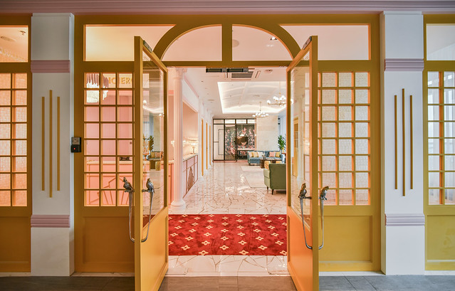
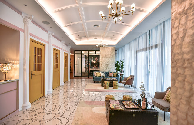
Welcome to Colony! Hehehe. Went for main double doors that are grand looking with facades flanking it, but countered it with an unexpected mustard color.
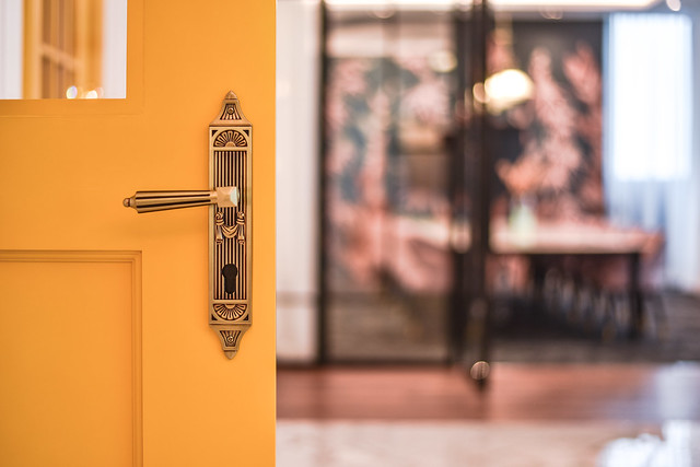
Our door handles are parrots! If you guys ever come to this Colony, you have to check out the details! There’s that saying “the devil is in the details” but really, this Colony’s beauty really lies in all our tiny details.
Jason also added the stylized border stickers on the glass which I love so much. T3T Gives it a little Art Deco touch!
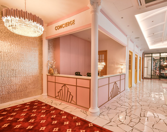
Once you step in our doors, you’re greeted with our reception and concierge area. Which very clearly drew its inspiration from The Grand Budapest Hotel hahaha. This area la! Sketched over seven times wtf until we pinned down the look we wanted.
And yes I am aware our runner looks like Louis Vuitton hahahaha.
Another angle of our reception. Our chandelier is gorgeous and picked out by Hui Wen, but even that came in at the last second! We’d originally had a row of light bulbs under the Concierge sign, and Hui Wen suggested swapping them out for this chandelier instead.
And our flooring also changed dunno how many times! I wanted terrazo cos I felt it would really capture the retro feel, but terrazo is very expensive actually! Out of my budget hahaha. And some more expensive but doesn’t look expensive cos in Malaysia it will forever be associated with terrace houses built in the 1980s wtf. I Pinterested like mad and settled on this broken marble floor that I think captured the essence even better – affordable and retro but still marble so still expensive looking.
The contractors really cursed me though cos this floor involves throwing down marble pieces to break them, then carefully piecing them together in a pleasing pattern sorry uncles.
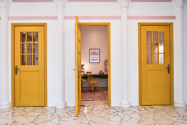
Next to the concierge are the phone booths and printing room. Doors of mustard to match with the front door.
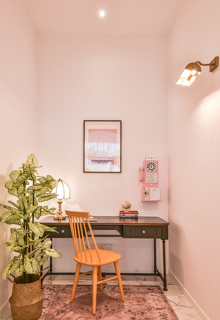
A peek inside one of our phone booths. All our wall prints are Wes Anderson connected – either literal movie posters, or more subtle references – pictures of characters or things featured in his movies.
Phone booth door handles.
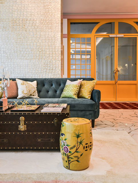
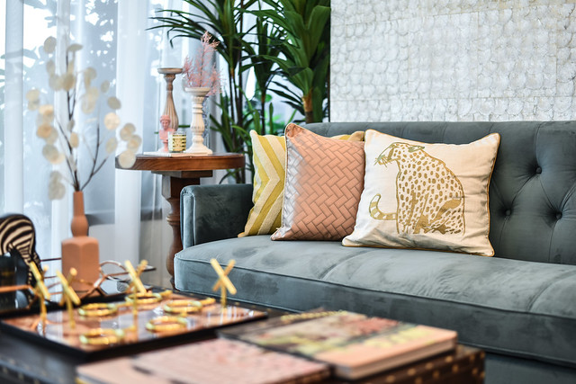
Lounge area. Jason and I picked out the couches and vintage trunk coffee tables, and Hui Wen brought the Chinese style stools and cushions. And styled the tables!
Those coffee table books are also Wes Anderson!
View of the lounge from the main entrance.
Shit is this magical or what wtf.
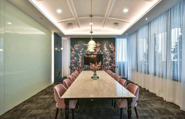
Our meeting rooms are always named after a great person, and the conference room in Colony @ MD is called Gandhi.
I asked for a lot of geometrical patterns especially round shapes, and Jason upped and gave me beautiful curved ceilings T____T I did not even know they could be a thing. T____T
Love all the wallpaper we chose. Colors for Gandhi are blush pink and dark cyan so uh there are a lot of both colors here wtf. *runs out of ways to describe it*
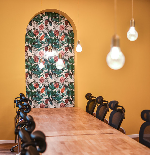
Here is our hot desking area. Lockers are off to the left of this photo so guests don’t have to worry about the security of their belongings. ^^
More bright colors, curved shapes and loud, floral motifs. ^^
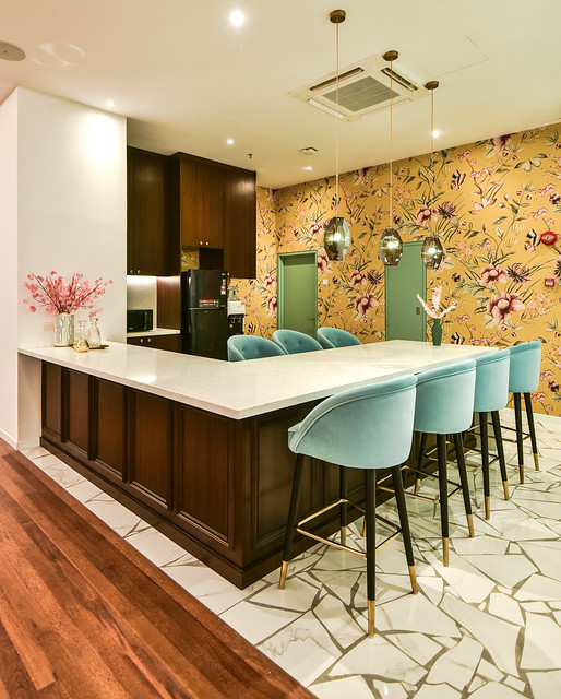
Our pantry! We don’t have an in house cafe in this center because there will be a cafe right across the corridor from us! So we created a bigger pantry for guests to sit and chill and even have discussions. I love it that Jason even painted the emergency and utility room doors mint green lolol.
Our other meeting room! Also done in blush pink but with more subtle shades of green. Did you see our super amazing fringed hanging lights! *hyperventilates* Who cares about how we’re going to dust it!
We christened this meeting room Kahlo, after Frida Kahlo.
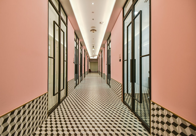
Our optical illusion corridor wtf. This corridor was also conceptualized pretty far into the design process and we played around with the color too. I wanted a more blue toned pink, going towards lavender a bit, but Jason kept saying coral is Pantone color of the year hahahaha. I don’t care about Color of the Year la cos every year it changes what! But our reception area looked best with this coral pink, and I agreed it wasn’t a good idea to introduce more than one shade of pink (already our color palette so rich) so we stuck to this.
I picked out these tiles before going on our Shanghai trip and to my horror when we were there, we visited this casual dumpling restaurant, super not fancy kind, and their tiles are these tiles WTF. They never maintain la and their tiles were blackened and I was completely horrified. I called Jason when I got back to cancel the order but he sent me a photo of his workers laying the tiles here already HAHAHA. So there we are. Whatever la, I am using these tiles in a much nicer way anyway hahaha.
Down this corridor is our nursing room. For nursing moms to either breastfeed their children if they need to, or pump and store their milk in a fridge we have for this use.
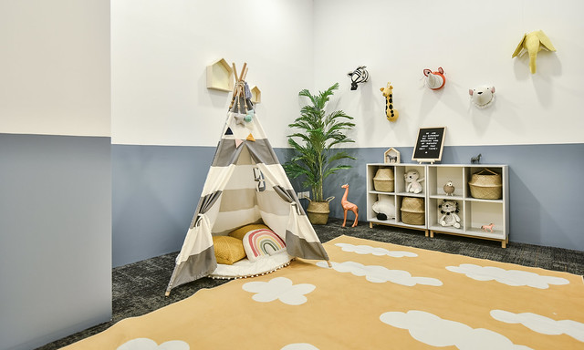
And our kids’ play area! This one credit goes to Jason and Hui Wen cos I had no hand in this hahaha. I just told them I wanted a white based room with pastel colors playing off it.
And our pink corridor leads up to…. our event space. ^^
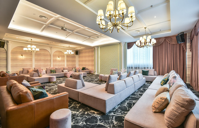
We designed this space for workshops, conferences or annual meetings. It’s sound proof, can be shut off for max privacy and furnished with modular furniture that can be arranged seminar style, group discussion style or even for product launches or parties.
So ya know, if you looking for an event space, lemme know wtf.
Another view.
And my video on our space! Plus what I did that day wtf. But the video doesn’t do it justice la cos I don’t know what I did with the colors and brightness but it looked completely different on my laptop when I was working on it wtf. 🙁
Just look at my photos ok wtf.
But in all honesty, this is so far, the Colony closest to my heart. We worked with a new designer whom I believed in, but was also quite green; I mean he already admitted to me this is his biggest project by far wtf. He’s good, but this concept is pretty unusual and stumped us at many, many points. I took more control than ever before, did more research than ever before and slowly, we pieced together this place (with Hui Wen who contributed so much with her amazing sense of style) that it now takes my breath away.
I learned and grew so much with this project and for that, Colony MD will always have a special place in my heart.










Comments (5)
The marble flooring is priceless! Pity the contractor uncle but the outcome is amazing!
DAMACAI,Toto, MAGNUM 4D Checkhere
How to Win4D Jackpot
my favourite space is definitely the reception and lounge. that broken marble floor and pink counter is TO DIE FOR! also, i loved your vlog! i’m so glad you did it. the walkthrough was amazing and brought such dimension to the spaces. well done, aud! you have such a flair for this. congratulations!!!
Punjab School Education Board has issued the PSEB 10th Question Paper 2022. Candidates can practise by downloading pdf files of past year exam papers from the Punjab board for class X. Aspirants will learn about the question paper by solving them, Punjab Board 10th Question Paper 2022 including the marking structure, types of questions asked, exam time, and so on. The PSEB Class 10th Exam 2022 will take place from April 9 to May 1, 2022. (tentative). For more information on PSEB 10th 2022 Question Paper, read the article.
This is a platform which brings the scholarship for students that are offered under central government, state government and thus government bodies, and National Scholarship Portal (NSP) has a list of 50 scholarships which totals to some hundreds of Crores, National Scholarship Portal and it is calculated that a total of Rs 2,400 crores scholarship has been provided under NSP to over 110 lakhs applicants. National Scholarship Portal (NSP) was introduced under the National e-governance Plan to offer Smart Mission Oriented Accountable Responsive and Transparent platform to provide scholarship for multiple series